Graphic & UI/UX Design
Graphic & UI/UX Design provides better outcomes for creatives and brands alike. Carefully crafted design strategy not only creates strong visual identity, but also bolsters brand authority, drives user engagement, and elicits qualified interaction. Careful design systems guarantee streamlined experience across touchpoints—web, mobile, social, email—so products and services reach appropriate people through streamlined visuals and ease of interaction. Since design results can be scalable and tested, great UI/UX and branding strategy becomes 24/7 growth engine—making it simpler to grab attention, lead through effortlessly, and convert and keep through clarity, convenience, and delight.
Importance of Graphic & UI/UX Design
With effective Graphic & UI/UX Design, brands can have an impact on a substantially broader audience than local markets. Careful visual identity and scalable design systems allow products to reach globally with accuracy—scaling without issue to varied cultures, platforms, and devices. Effective design practice provides several essential benefits: an integrated, visible presence, increased brand credibility, multi-platform consistency, asset reuse at lower cost, deeper user engagement, data-driven iteration (through test and analytics), higher-quality leads due to clearer interfaces and communication, and ongoing competitive advantage through distinctive, user-centric experiences.
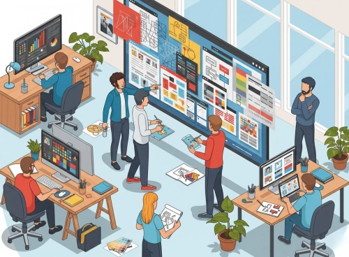
Visual Identity & UI/UX: Powering Digital Growth
Introduction to UI/UX
In this era and time, great Graphic & UI/UX Design holds the same significance for businesses and creatives both. Graphic and UI/UX design involve knowing how products, services, and brands are experienced and used through digital channels—the intersection of business needs and user experience and visual identity. It involves primary areas of brand identity, design systems, interface design, interaction design, accessibility, content design, and prototypes.
A well-thought-out design strategy not only captures potential consumers’ attention through lovely visuals, but also drives brand awareness through stable identity, drives interaction through intuitive flows and obvious hierarchy, and drives better conversions through persuasive composition, micro-interactions, and thoughtfully positioned CTAs. Balancing aesthetics and usability and tested through real people, Graphic & UI/UX Design transforms attention into trust—and trust into action.
The Importance of UI/UX Graphics
Graphic and UI/UX design is one of the most important elements to grab and retain user attention. The well-crafted, stunning interface makes an instant impression and compels consumers to take a peek at the brand. Consistent identity, clear hierarchy, and beautiful micro-interactions instill trust and believability across all digital touch points.
Successful design planning enhances the customer experience through appropriate visuals, appropriate content structure, convenient navigation, and clear, accessible calls to action. It also aids discoverability and visibility: rightly ordered interfaces, brisk-running content, and people-centered design patterns follow best practices adored by search engines and platforms—enabling the brand to appear more often and stand out clearly and consistently in their results and streams.
Key Elements of Effective UI/UX
Content Strategy (Design Systems & Content Design):
Content is the backbone of design. A well-structured content strategy paired with a design system ensures that interfaces, components, and layouts are engaging, informative, and aligned with brand goals—across web, mobile, and social assets.
Visual Branding (Colors, Themes & Components):
Color palettes, themes, and creative assets shape perception. Consistent use of brand colors, grids, iconography, and component styles builds trust, recall, and stronger emotional connections through a cohesive visual language.
Messaging & Copy (Typography & Tone of Voice):
Words and type work together. Clear, persuasive microcopy with readable typography scales (headings, body, captions) defines brand personality, improves readability, and drives engagement and conversions across interfaces.
Images, Videos & Graphics (Design Assets):
High-quality imagery, motion, and illustration elevate product storytelling. Thoughtful use of graphics, short videos/reels, and infographics captures attention fast and communicates complex ideas with clarity.
Layout, Spacing & Visual Hierarchy (Whitespace):
Just like digital whitespace in layouts, intentional spacing, alignment, and hierarchy keep pages uncluttered. Strategic placement of key elements and balanced negative space direct focus to what matters most.
User Journey & Navigation (Flows & IA):
Guide users seamlessly from discovery to action with clear information architecture, intuitive navigation, and frictionless flows. Well-designed funnels and optimized screens help users find what they need quickly.
Calls to Action (CTAs) & Interaction Design:
Strong, accessible CTAs with clear labels, contrast, and affordances prompt immediate action—click, buy, sign up, or contact. Strategic placement, size, and motion cues increase clarity and conversion.
Cross-Device Responsiveness (Responsive & Adaptive UI):
Most users are on mobile. Responsive grids, flexible components, and adaptive imagery ensure a smooth, consistent experience across screen sizes and platforms—improving usability and brand consistency everywhere.
Choosing the Right Graphic & UI/UX Design Channels
Choosing appropriate design touchpoints helps to achieve business objectives. Weigh in elements such as intended users, budget, design outcomes, scalability, and how assets work across products and platforms. Familiar design channels and formats comprise brand identity systems, UI element sets, web/app interfaces, social media assets, motion graphics, illustration, and email templates. Study and compare one option’s strength, reach of people, production effort, and potential for reuse to select an assortment which returns maximum ROI—emphasizing consistency, accessibility, and efficiency across each touchpoint.
Planning and Organizing Graphic & UI/UX Design Projects
Prior to undertaking large-scale design work, conceptualize and define creative and UX strategy to be delivered. Develop core user personas, define exact business and design outcomes, and select ideal touchpoints and formats—brand identity system, UI element library, app and web interfaces, social creatives, motion graphics, or email templates. Develop content and visual strategy (info architecture, design system tokens, layout patterns, and creative concepts) to align brand and product targets. Ensure deliverables are compelling, user-tested, and data-driven—optimized for accessibility, responsiveness, and conversion across platforms and devices.
Seamless User Journey in Graphic & UI/UX Design
Creating an intuitive design flow directs people through each stage of the experience. Use straightforward, concentrated microcopy and graphics across core screens and elements, such that every interaction leads directly to the next one in sequence. Provide access to related content and offers in an intuitive way, through in-content links and streamlined composition. Use session-aware patterns (saved progress, recently used, smart reminders) to re-engage people and allow continuing from where they left it. Use consistent typography, color, iconography, and element behavior across platforms and device types to deliver an intuitive, trustworthy, and compelling product experience.
Creative Visuals & Strong Brand Presence in Graphic & UI/UX Design
Visual design helps to create an effective, recognizable brand image in digital touch points. The use of relevant color systems, typography scales, and creative visuals in an ongoing fashion helps to reach out to intended people and bring forth relevant sentiments. Consistency in visual aspects—logos, palettes, type, iconography, imagery style, and element pattern in web, app, and social assets solidifies brand identification, lends credibility, and generates an enduring, distinctive memory.
Responsive UI for Every Device
As consumption both on tablet and mobile continue to increase, it’s time to develop interfaces to better capitalize on mobile. Responsive, adaptive UI design generates content, elements, and graphics, which adapt automatically to every size in terms of screens and handsets. It provides not only improved user experience, it’s better for engagement, conversion lift, and search appearance through fast, seamless, and mobile-enabling design.
SEO-Informed Visual Design for Stronger Discovery
Using good design-for-discoverability techniques can have an important role to play in increasing visibility and driving organic engagement. Begin at the research stage of audiences and intent to help in naming, labelling, and content hierarchy across layouts and components. Use interfaces optimized for good information architecture: semantic labels on head elements, accessible alt text, descriptive link text, and scannable sections to match how people search and read.
Prioritize creating high-quality, compelling, and shareable design assets—entirely modular content elements, illustrations, motion snippets, and infographics—that inspire saves, shares, and actual mentions. Make sure the product loads fast technically, mobile-first and responsive design, and accessible patterns to provide an all-around better experience across the user base.
Continuously monitor, understand, and refine through product analytics and usability results: adjust navigation, internal links, microcopy, and component interactions to outpace competition and deliver max ROI through increased clarity, velocity, and usability.
Faster Interfaces, Higher Conversions: UI/UX Performance Design
Visual performance optimization helps to deliver an optimal user experience as much as discoverability boosts. Prefer fast-loading, lightweight design by compressing image/illustrations and choosing sensible size, leveraging most recent formats (WebP/AVIF), and optimized typography (fewer font family/weights). Reduce visual and interaction overhead through streamlined component libraries, thoughtfully used motion, and optimized icon systems (SVG).
Restrict front-end loading with design decisions that allow for lean builds: reduce styles, minimize heavy decoration, and maintain reusable components. Accompany fast rendering by careful use of whitespace, clear hierarchy, and progressive disclosure to allow important content to appear fast and be scannable. Take advantage of caching-friendly asset approaches and versioned design assets to maintain returning experiences fast.
Performance-first design process: Regularly audit interaction behavior, typography, and imagery; test on handsets and mobile networks; and debug laggy spots. On-time and regular optimization ensures maintaining a seamless, credible experience leading to higher engagement and conversion and facilitating better discoverability in search and app stores.
Leveraging UI/UX Patterns in Social Creatives for Higher Engagement
Integrating social sites into product and site design is an effective means of increasing participation, broadening brand presence, and fostering community. Include visually obvious, accessible social share elements with high affordances to facilitate effortless sharing. Insert branded social modules—real-time feeds, highlight reels, or profile links—through consistent color, typography, and icons to promote cross‑platform connection. Leverage embeddable widgets (reels, posts, UGC carousels, testimonial blocks) that fit the design system, respect hierarchy, and do not create visual clutter. Careful placement, responsive designs, and motion cues make these social items feel integrated to the interface while enhancing overall brand presence.
Building Trust with Secure Design Systems and Interfaces
With product-based designs, security concerns extend from data protection—to also engendering confidence and believability through clear, reassuring interfaces. Reducing friction and enhancing completion rates result from secure UX cues for high-stakes flows like sign-up, checkout, and account management.
- Use overt signals of trust: lock indicators for HTTPS connections, security badges, and prominent privacy notices to reassure users at the right moment.
- Encryption for confidence: Explain SSL/TLS security with brief microcopy close to forms and payment inputs to instill confidence.
- Stay up-to-date with systems: Consider frequent updates of your components and design system concurrent with updates of the platform and plugins for eliminating vulnerabilities.
- Strong auth UX: Prompt for strong, unique passwords with strength meters, togglable show/hide, and cues; provide MFA/OTP with unambiguous steps and easily discoverable error states.
- Recovery by design: Provide seamless, secure streams for account recovery (email/SMS verification, device checks) with simple message and progressive disclosure.
- Backup and resilience: Non-intrusive surface level status and recovery indicators (autosave indicators, last backup timestamps) which give the user reassurance that their data is safe.
- Consistency and clarity: Consistent typography, iconography, and component behavior minimize perceived risk and hesitation when performing sensitive actions.
- A security-conscious UI not just makes conversion and user confidence more robust, but also facilitates good discoverability—consistent, fast, well-structured experiences align with best-of-breed help and search best practices for increased visibility.
Design Analytics: Measuring UX Impact and Outcomes
Quantifying and analyzing your design performance allows you to take data‑driven decisions and extract maximum yield. Utilize product analytics and UX research tools for behavior tracking as well as for goal completion of principal flows. Keep your core UX and business metrics as the success rate of the task, time spent by the user during the task, drop‑off rate, top CTAs click‑through, conversion rate, retention, and satisfaction scores (e.g., NPS, SUS, CSAT). Quantify the engagement pattern by utilizing heatmaps, session replays, and funnel analysis for the detection of friction as well as usability points.
Translate insights into iteration-based refinements of the design: refine information architecture, simplify interactions, simplify microcopy, and simplify order of components. Implement clear thresholds, test layouts and CTAs with A/B or multivariate tests, and log learnings against your design system for future reference. Continuous, metrics-based UI/UX workflow makes strengths speak for themselves, gaps as plain as day, and priorization clear—so each iteration brings product closer to clarity, speed, accessibility, and higher conversion.
Avoid These UI/UX and Visual Design Pitfalls
Deploying excessive, irrelevant visuals and components that confuse users instead of guiding them to a clear action.
Using poor color contrast, clashing palettes, or inconsistent visual language that weakens brand identity and erodes trust.
Neglecting mobile-first design for key screens and flows, resulting in cramped layouts, tiny tap targets, and broken navigation on phones.
Ignoring structural SEO-aligned design practices—semantic headings, accessible alt text, readable typography—hurting discoverability.
Failing to evolve the design system, components, and patterns regularly, creating performance, accessibility, and security gaps.
Not optimizing assets—oversized images, uncompressed videos, too many font weights—causing slow loads and low engagement.
Overlooking user insights, A/B tests, and usability feedback; shipping unvalidated flows that depress task completion and conversions.